With the development of new ad formats, advertisers needed a way to intuitively learn and create ad formats that do not exist on other social media platforms.
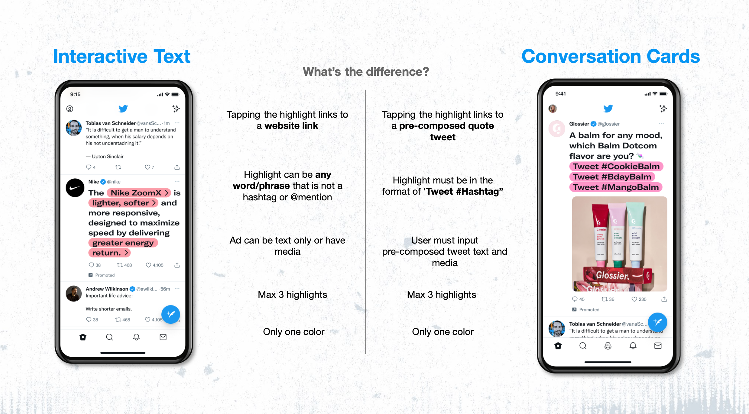
Both formats leveraged the same interaction, highlighted linked text, in order to increase engagement. However, there were several key similarities and differences that I needed to consider when designing the creation flow.
The new designs should be intuitive and clear on what they are creating and how to create this new ad format.
With the many specific requirements of this ad, we need to find "fool-proof" ways to guide advertisers through them.
Designs should be scalable and be reused for any future designs and new ad formats.
What I found to be an interesting design challenge was balancing a design that allowed advertisers to quickly understand how to make these new ad formats while also providing enough guidance since these ad formats are not seen anywhere else on social media.
In our ads platform ecosystem, any changes should work without negatively disrupting the current user experience. As we continue to implement new and innovative ad formats, the designs should look to improve the current flow and be scalable to future ad formats.
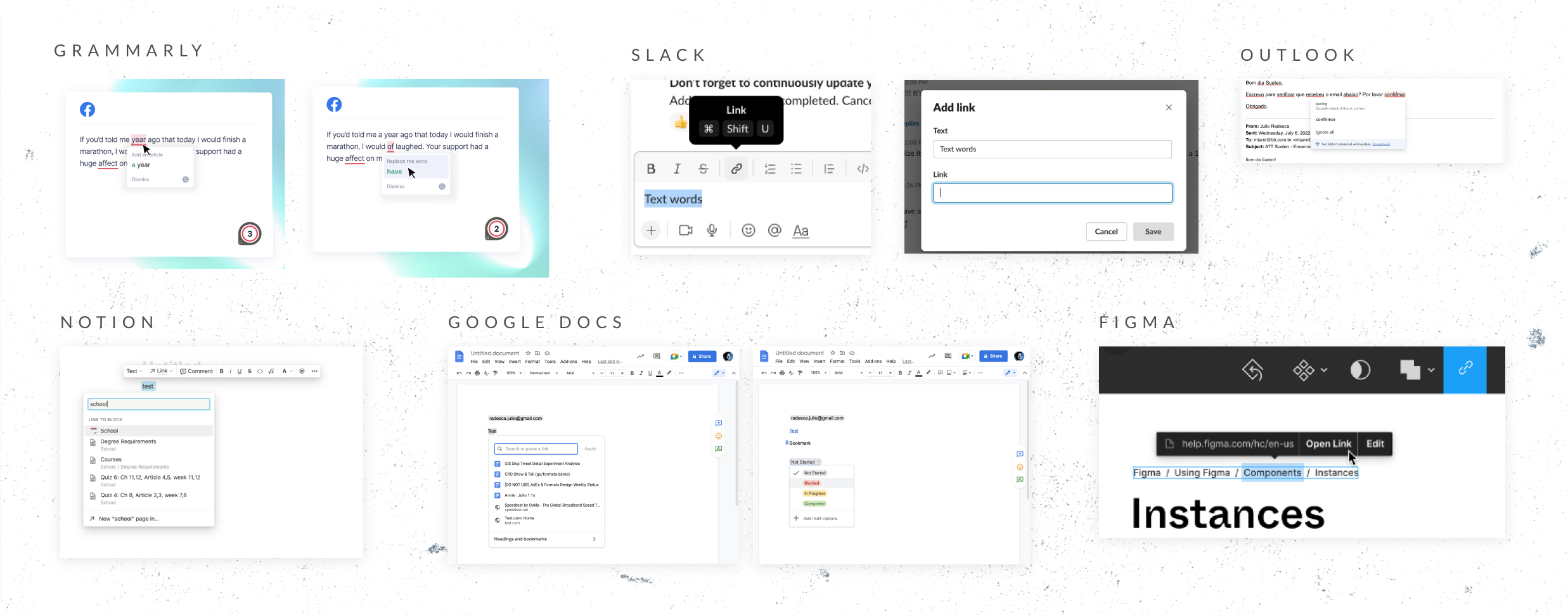
These were ad formats that are unique to Twitter that leverages Twitter's strength as a text-based platform. Since I would not be able to see any type of creation flow from our competitor's to do a competitor analysis, I looked elsewhere at similar flows that users might be familiar with and see if we can incorporate any into our creation flow.
The team had looked into an ad creation flow that took the metadata being uploaded in order to automatically create multiple campaigns (similar to Meta ads). When observing users' behaviour, almost all advertisers preferred it the manual way.
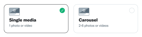
With these two ad formats needing specific requirements, the design should be intuitive enough to know what is needed yet still provide the customizations advertisers need.
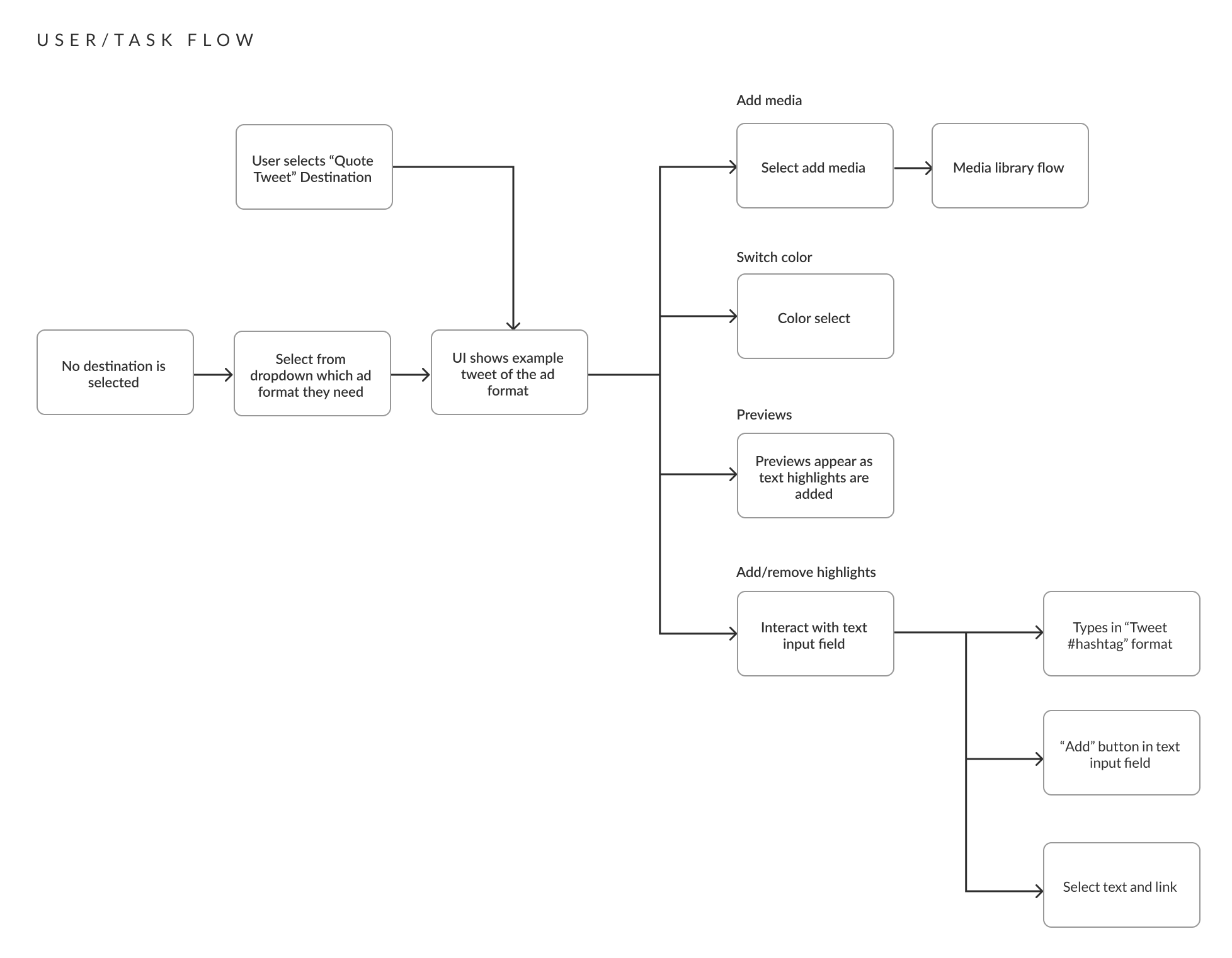
Early in the iteration process, I knew it would be important to get eyes and feedback on even early concepts. Understanding the engineering feasbility helped guide my explorations. In the early stages, I learned it was best to iterate a lot and even on possibilities Twitter had not yet explored.
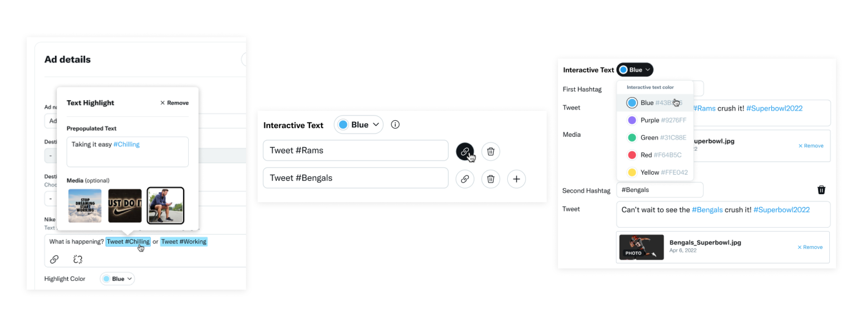
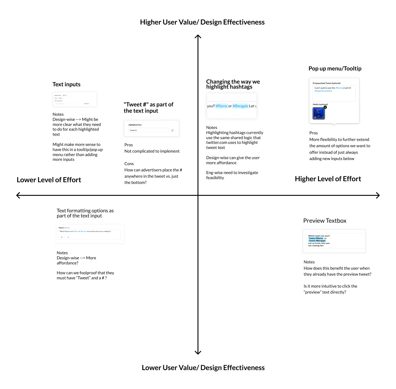
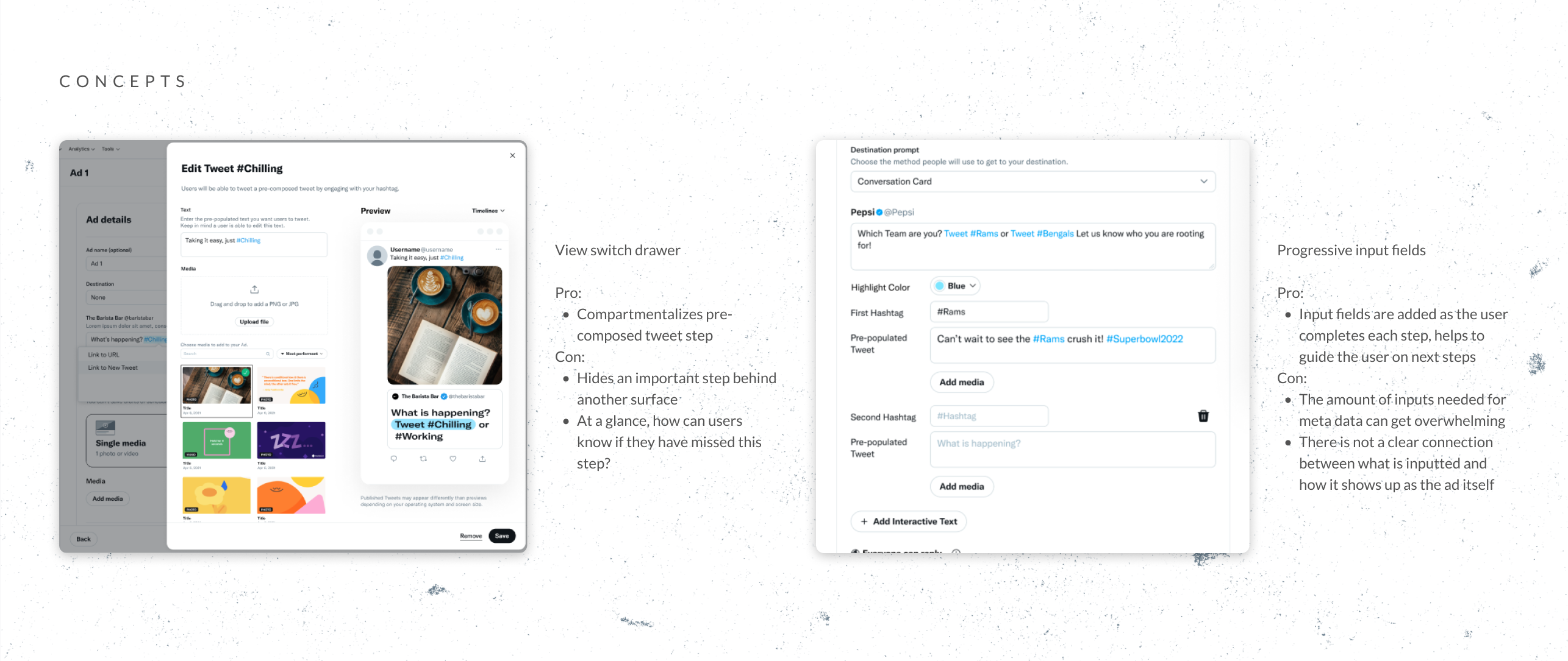
Design critiques helped narrow down our design solutions to two main concepts. At this stage, having full high-fidelity mockups helped our engineers and product managers understand the exact scope of development and which solution would have higher user value that would still fit within our timeline. For the next step, we decided to proceed with a variation of the progressive input fields design.
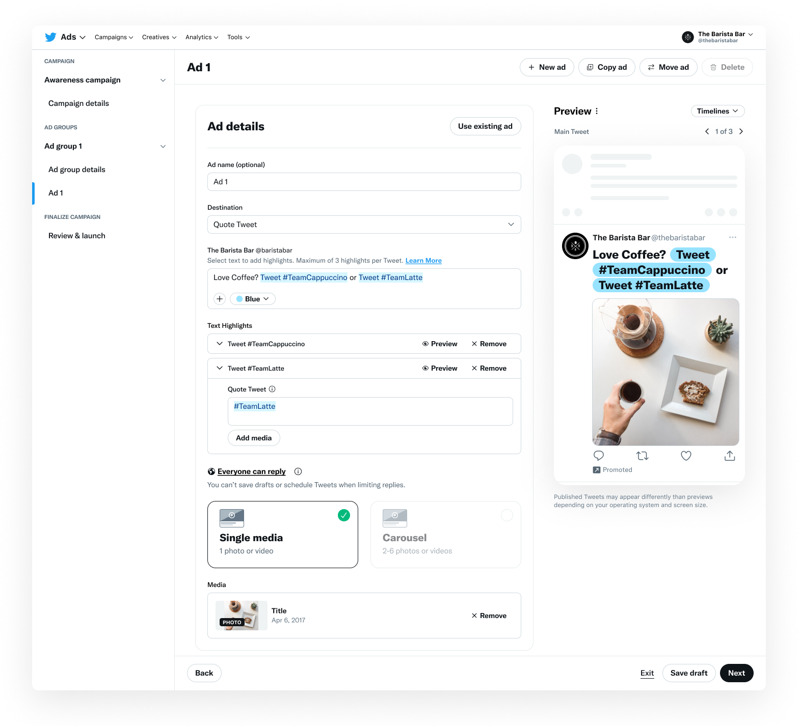
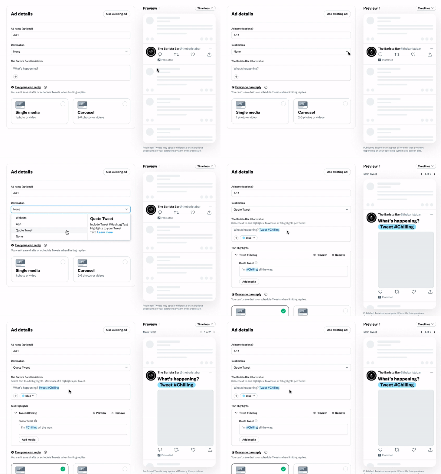
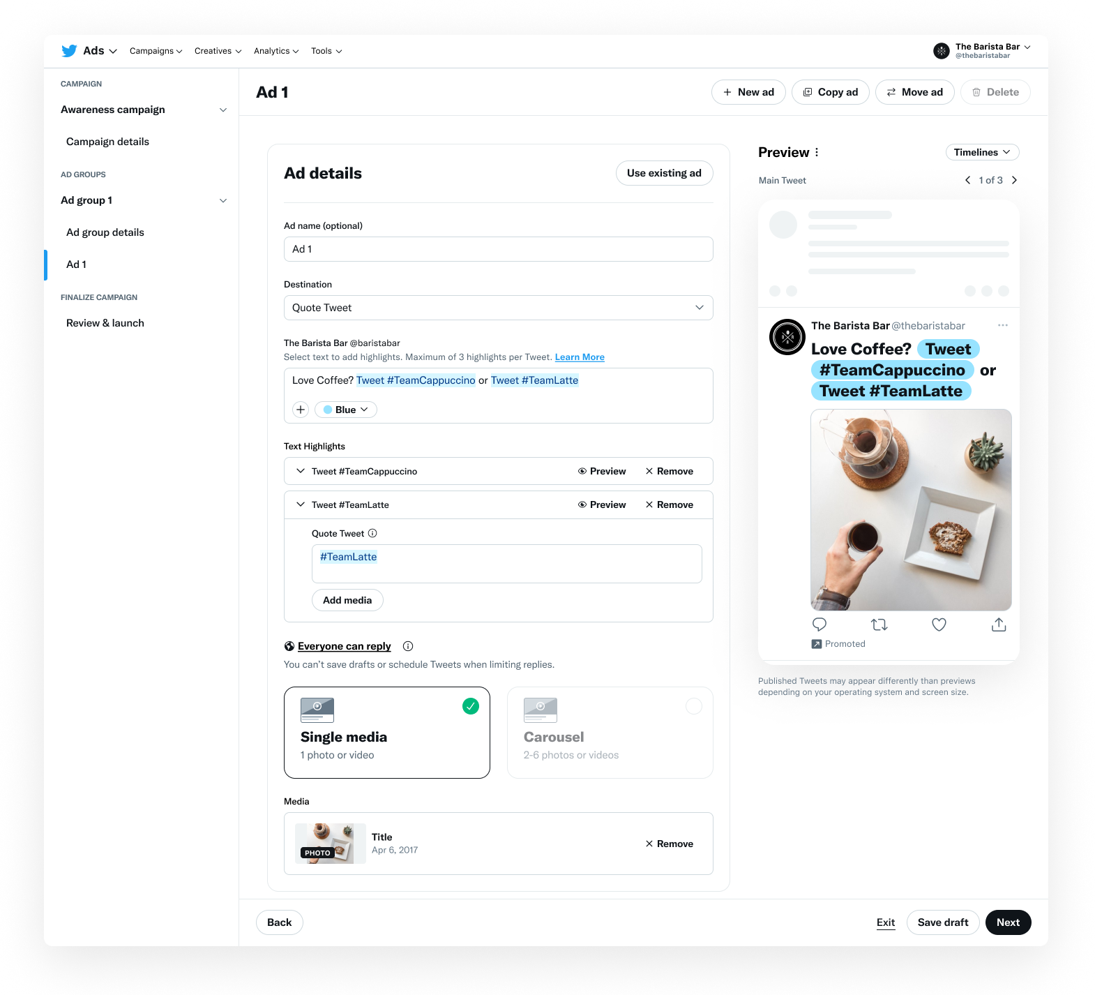
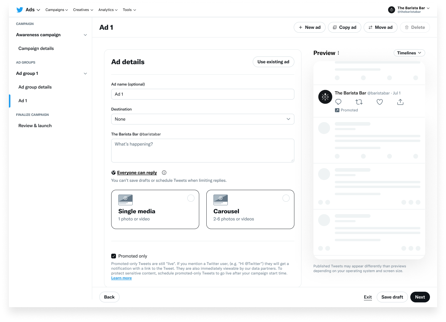
To help advertisers learn how the ad format works, the example text and preview does not disappear if the user starts typing in the text field.
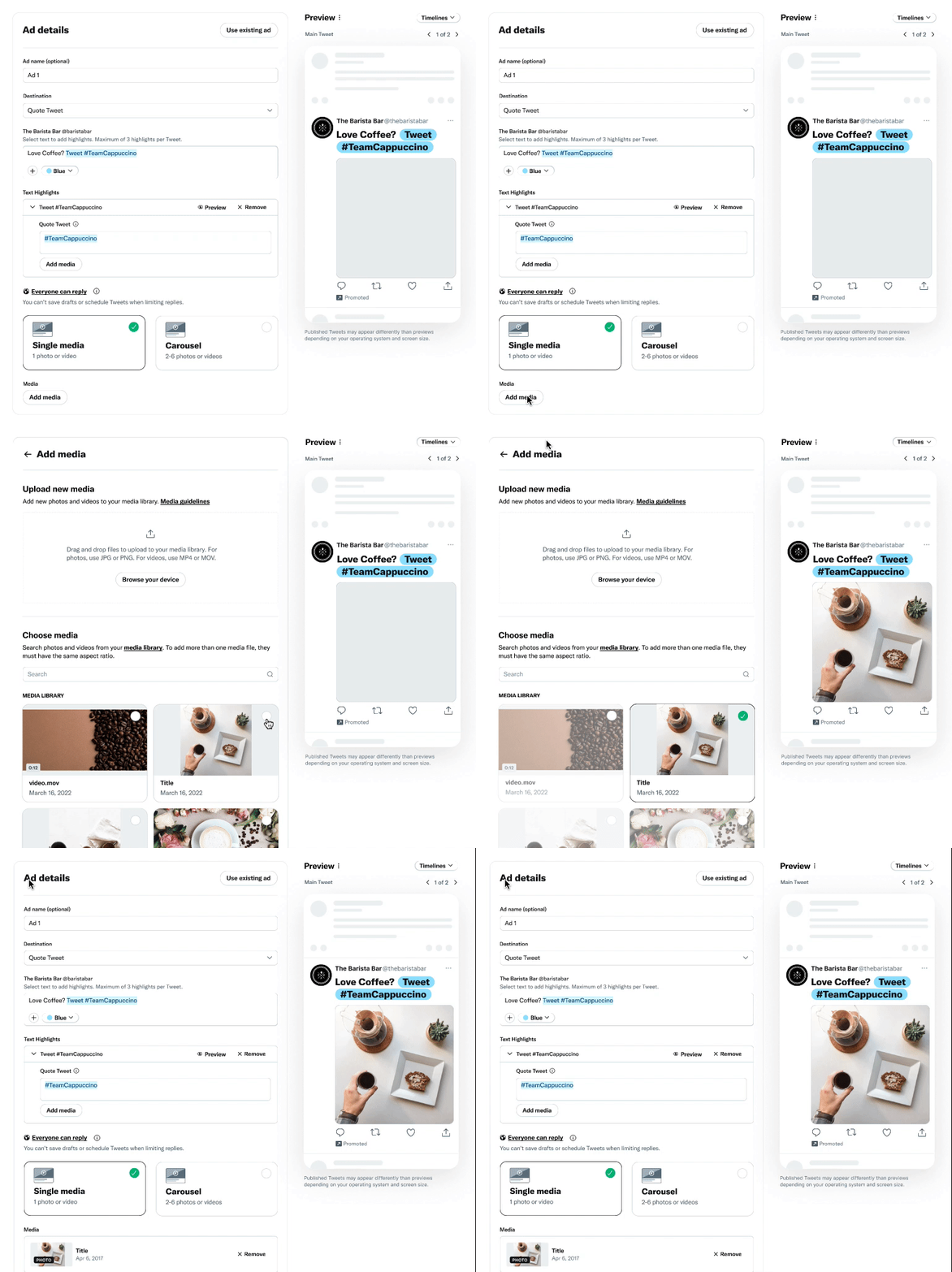
The ad creation flow incorporates into the media flow that has already been established on the ad experience platform that advertisers are familiar with. The interaction is the same for adding media to the pre-composed quote tweet.
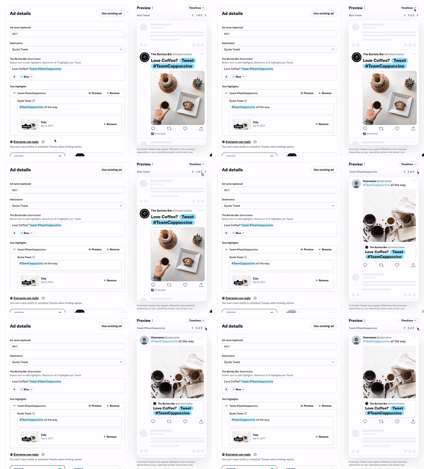
There are two ways users can switch between previews:
Preview Pagination: Users can switch between previews of the Main Ad Tweet and Pre-composed Tweets
Preview Button: In the Text Highlights section, users can press the preview button and the preview will show that Pre-composed Tweet.
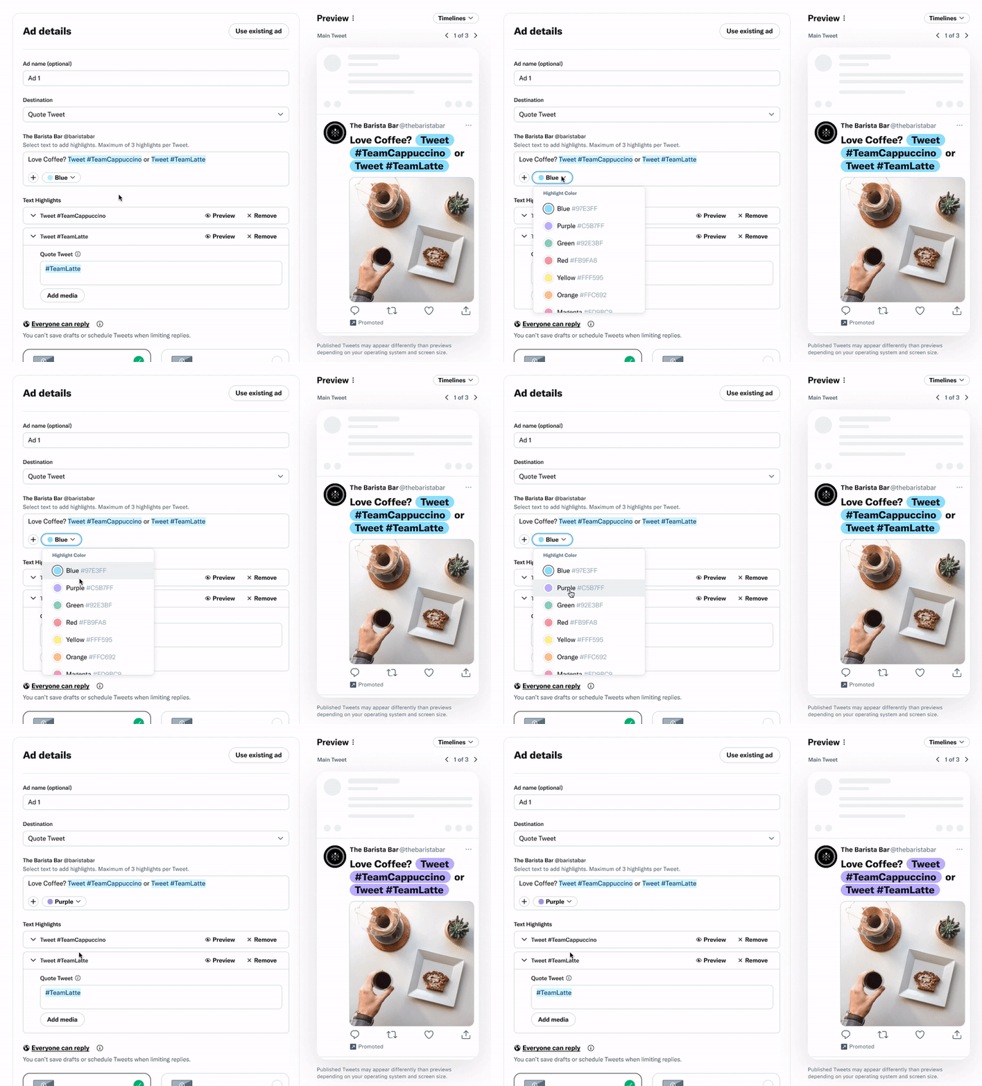
For this ad format, advertisers can choose between 10 colors. Since brands cannot use their own, the hex code is provided in case their marketing team would like to mock it up on their end.
Only the preview shows the color change, as we have found from feedback that changing the color in the text input field as well causes some confusion.
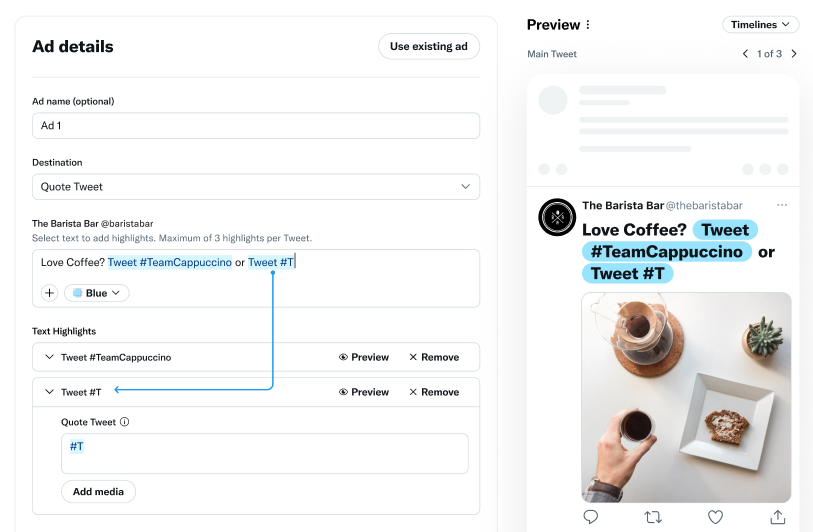
There are 3 ways a user can add text highlights, users should have the ability to do all three. These interactions were incorporated as they are ones all users would be familiar with already.
• Recognizes when user types in “Tweet #hashtag” format
• User uses the “add” button in text input field
• Users can select text and link
Users can edit the Text Highlight directly in the text input field